Posted by DarrenKingman
Content link building: Are infographics still the highest ROI format?
Fun fact: the first article to appear online proclaiming that "infographics are dead" appeared in 2011. Yet, here we are.
For those of you looking for a quick answer to this strategy-defining question, infographics aren’t as popular as they were between 2014 and 2015. Although they were the best format for generating links, popular publications aren’t using them as often as they used to, as evidenced in this research. However, they are still being used daily and gaining amazing placements and links for their creators — and the data shows, they are already more popular in 2018 than they were in 2013.
However, if there’s one format you want to be working with, use surveys.
Note: I am at the mercy of the publication I’ve reviewed as to what constitutes their definition of an infographic in order to get this data at scale. However, throughout my research, this would typically include a relatively long text- and data-heavy visualization of a specific topic.
The truth is that infographics are still one of the most-used formats for building links and brand awareness, and from my outreach experiences, with good reason. Good static visuals or illustrations (as we now call them to avoid the industry-self-inflicted shame) are often rich in content with engaging visuals that are extremely easy for journalists to write about and embed, something to which anyone who’s tried sending an iframe to a journalist will attest.
That’s why infographics have been going strong for over a decade, and will continue to for years to come.
My methodology
Prophecies aside, I wanted to take a look into the data and discover whether or not infographics are a dying art and if journalists are still posting them as often as they used to. I believe the best way to determine this is by taking a look at what journalists are publishing and mapping that over time.
Not only did I look at how often infographics are being used, but I also measured them against other content formats typically used for building links and brand awareness. If infographics are no longer the best format for content-based link building, I wanted to find out what was. I’ve often used interactives, surveys, and photographic content, like most people producing story-driven creatives, so I focused on those as my formats for comparison.
Internally, you can learn a ton by cross-referencing this sort of data (or data from any key publication clients or stakeholders have tasked you with) with your own data highlighting where you're seeing most of your successes and identifying which formats and topics are your strengths or weaknesses. You can quickly then measure up against those key target publications and know if your strongest format/topic is one they favor most, or if you might need to rethink a particular process to get featured.
I chose to take a look at Entrepreneur.com as a base for this study, so anyone working with B2B or B2C content, whether in-house or agency-side, will probably get the most use out of this (especially because I scraped the names of journalists publishing this content — shh! DM me for it. Feels a little wrong to publish that openly!).
Disclaimer: There were two methods of retrieving this data that I worked through, each with their own limitations. After speaking with fellow digital PR expert, Danny Lynch, I settled on using Screaming Frog and custom extraction using XPath. Therefore, I am limited to what the crawl could find, which still included over 70,000 article URLs, but any orphaned or removed pages wouldn’t be possible to crawl and aren’t included.
The research
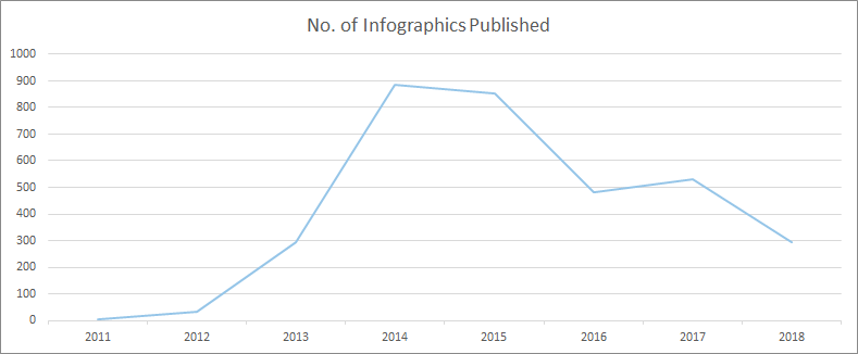
Here's how many infographics have been featured as part of an article on Entrepreneur.com over the years:

As we’ve not yet finished 2018 (3 months to go at the time this data was pulled), we can estimate the final usage will be in the 380 region, putting it not far from the totals of 2017 and 2016. Impressive stuff in comparison to years gone by.
However, there's a key unknown here. Is the post-2014/15 drop-off due to lack of outreach? Is it a case of content creators simply deciding infographics were no longer the preferred format to cover topics and build links for clients, as they were a few years ago?
Both my past experiences agency-side and my gut feeling would be that content creators are moving away from it as a core format for link building. Not only would this directly impact the frequency they are published, but it would also impact the investment creators place in producing infographics, and in an environment where infographics need to improve to survive, that would only lead to less features.
Another important data point I wanted to look at was the amount of content being published overall. Without this info, there would be no way of knowing if, with content quality improving all the time, journalists were spending a significantly more time on posts than they had previously while publishing at diminishing rates. To this end, I looked at how much content Entrepreneur.com published each year over the same timeframe:

Although the data shows some differences, the graphs are pretty similar. However, it gets really interesting when we divide the number of infographics by the number of articles in total to find out how many infographics exist per article:

There we have it. The golden years of infographics were certainly 2013 and 2014, but they've been riding a wave of consistency since 2015, comprising a higher percentage of overall articles that link builders would have only dreamed of in 2012, when they were way more in fashion.
In fact, by breaking down the number of infographics vs overall content published, there’s a 105% increase in the number of articles that have featured an infographic in 2018 compared to 2012.
Infographics compared to other creative formats
With all this in mind, I still wanted to uncover the fascination with moving away from infographics as a medium of creative storytelling and link building. Is it an obsession with building and using new formats because we’re bored, or is it because other formats provide a better link building ROI?
The next question I wanted to answer was: “How are other content types performing and how do they compare?” Here’s the answer:

Again, using figures publisher-side, we can see that the number of posts that feature infographics is consistently higher than the number of features for interactives and photographic content. Surveys have more recently taken the mantle, but all content types have taken a dip since 2015. However, there’s no clear signal there that we should be moving away from infographics just yet.
In fact, when pitting infographics against all of the other content types (comparing the total number of features), apart from 2013 and 2014 when infographics wiped the floor with everything, there’s no signal to suggest that we need to ditch them:
|
Year |
Infographics vs Interactives |
Infographics vs Photography |
Infographics vs Surveys |
|---|---|---|---|
|
2011 |
-75% |
-67% |
-90% |
|
2012 |
-14% |
-14% |
-65% |
|
2013 |
251% |
376% |
51% |
|
2014 |
367% |
377% |
47% |
|
2015 |
256% |
196% |
1% |
|
2016 |
186% |
133% |
-40% |
|
2017 |
195% |
226% |
-31% |
|
2018 |
180% |
160% |
-42% |
This is pretty surprising stuff in an age where we’re obsessed with interactives and "hero" pieces for link building campaigns.
Surveys are perhaps the surprise package here, having seen the same rise that infographics had through 2012 and 2013, now out-performing all other content types consistently over the last two years.
When I cross-reference to find the number of surveys being used per article, we can see that in every year since 2013 their usage has been increasingly steadily. In 2018, they're being used more often per article than infographics were, even in their prime:

Surveys are one of the "smaller" creative campaigns I’ve offered in my career. It's a format I’m gravitating more towards because of their speed and potential for headlines. Critically, they're also cheaper to produce, both in terms of research and production, allowing me to not only create more of them per campaign, but also target news-jacking topics and build links more quickly compared to other production-heavy pieces.
I think, conclusively, this data shows that for a solid ROI when links are the metric, infographics are still competitive and viable. Surveys will serve you best, but be careful if you’re using the majority of your budget on an interactive or photographic piece. Although the rewards can still be there, it’s a risk.
The link building potential of our link building
For one last dive into the numbers, I wanted to see how different content formats perform for publishers, which could provide powerful insight when deciding which type of content to produce. Although we have no way of knowing when we do our outreach which KPIs different journalists are working towards, if we know the formats that perform best for them (even if they don’t know it), we can help their content perform by proxy — which also serves the performance of our content by funneling increased equity.
Unfortunately, I wasn’t able to extract a comment count or number of social shares per post, which I thought would be an interesting insight to review engagement, so I focused on linking root domains to discover if there is any difference in a publisher's ability to build links based on the formats they cover, and if that could lead to an increase in link equity coming our way.
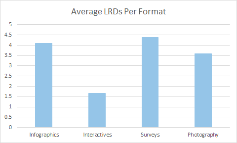
Here’s the average number of links from different domains for each post featuring a different content type received:

Impressively, infographics and surveys continue to hold up really well. Not only are they the content types that the publisher features more often, they are also the content types that build them the most links.
Using these formats to pitch with not only increases the chances that a publisher's post will rank more competitively in your content's topic area (and put your brand at the center of the conversation), it’s also important for your link building activity because it highlights the potential link equity flowing to your features and, therefore, how much ends up on your domain.
This gives you the potential to rank (directly and indirectly) for a variety of phrases centered around your topic. It also gives your domain/target page and topically associated pages a better chance of ranking themselves — at least where links play their part in the algorithm.
Ultimately, and to echo what I mentioned in my intro-summary, surveys have become the best format for building links. I’d love to know how many are pitched, but the fact they generate the most links for our linkers is huge, and if you are doing content-based link building with SEO-centric KPIs, they give you the best shot at maximizing equity and therefore ranking potential.
Infographics certainly still seem to have a huge part in the conversation. Only move away from them if there’s proof in your data. Otherwise, you could be missing out for no reason.
That’s me, guys. I really hope this data and process is interesting for everyone, and I’d love to hear if you’ve found or had experiences that lead to different conclusions.
Sign up for The Moz Top 10, a semimonthly mailer updating you on the top ten hottest pieces of SEO news, tips, and rad links uncovered by the Moz team. Think of it as your exclusive digest of stuff you don't have time to hunt down but want to read!
from Moz Blog https://ift.tt/2CAWvuQ

No comments:
Post a Comment