Sunday, December 1, 2013

Kyle Rush Reveals How the Obama Campaign Broke Every Online Fundraising Record: Free #MozCon Video

Posted by EricaMcGillivray


Buy the MozCon 2013 Video Bundle


Every year at MozCon, I have the joy of working with our fabulous MozCon speakers. One of the speakers, who we were most excited about for MozCon 2013, was Kyle Rush. Kyle's name might not be on the tip of your tongue, but he worked on possibly the biggest and best online marketing campaign, Obama for America, as their deputy director of front-end web development. From there, he went to The New Yorker, and he just announced that he's headed over to Optimizley.


When Kyle told us he wanted to present about the conversion rate optimization and a/b testing the Obama campaign did, there may have been some squeeing from Rand (like the Packers won) and me (like over new Sherlock episodes). Marketing nerds. Because regardless of your politics, Obama's reelection campaign not only broke fundraising records, but changed the way we think about using big data and CRO.


Kyle rocked that MozCon 2013 stage. He presented a ton of actionable information for attendees, and he was one of our top scoring presentations. When we went to decide which full-length MozCon presentation to share with all of you, for free, Kyle's was it. Enjoy!


Video Transcription


Kyle: Thank you, Cyrus. It feels great to be in Seattle. I just came from New York City. Is anybody else here from New York? Yeah. You guys all know what I mean when I say it feels great to be in Seattle. You guys know how to do the summer with this 77 degree weather. This dry heat is awesome. We've got to figure out how to get that in New York City. Can we get on that?


As Cyrus said, my name is Kyle Rush. I'm currently at 'The New Yorker.' Before that I was at the Obama campaign. I worked on a lot of the product and tech aspects of our online fundraising. Obviously, we ran a lot of optimization on that. So, that's what I'm going to be talking to you guys today about.


Before we get started, I want to give you guys some context on what we jumped into, the situation on day one at the Obama campaign. All the media outlets at the time were reporting that we were expected to raise one billion. They did probably $700 million in 2008. So, we were expected to raise one billion.


Just to put that into perspective for you guys, Amazon's Q4 profit for last year was only $97 million. So, when you spread that out over a year and a half, which was the life of the campaign, you still only get like half or a little over half what we were expected to raise on the campaign. So, this was a pretty daunting challenge.


But, in the end... Oh, I didn't mean to click to. But, in the end we did $1.1 billion. So, we exceeded expectations. None of us thought we could do it. Obviously, that's a lot of money. We did $690 million of it online as Cyrus said.


Another thing that I want to talk to you guys about is just an example of one of our online fundraising programs. That was called Quick Donate. This was a way for our users to save their payment information so that they could do one click donations on the Web, and they could also do one click donations in email - which had never been done before. So, we had to do a lot of funky engineering to get that to work.


But, you could also SMS donate which was a first for political campaigns. It was actually a big achievement for us. Because the Federal Election Commission said that political campaigns can not use short codes to fundraise. So, we weren't allowed to work with AT&T and Verizon to send out short codes and ask people to text those. We had to engineer a way around that. When we launched SMS donations it was the first of its kind.


Quick Donate brought in $115 million over its lifespan. It had 1.5 million users. This was a thrill to work on. But, obviously, this type of program we optimized. We ran a lot of tests. Those are kind of the things I'm here to share with you guys.


You might ask how did we get here. We ran 500 experiments. We always had a test running. It was really, really intense the amount of traffic that we had. We did weeks of user testing. User testing is really simple. It's just putting a user in front of a computer and observing them.


We used a program called Silverback. I don't know if any of you guys are familiar with it. But, it records the eyesight camera and the computer screen at the same time. So, you can actually see your user making a donation. We learned a lot from this. We did it on and on and on to the point where we probably did weeks of it.


Sorry, this thing is pretty sensitive.


We also just did general data gathering which I really like to do. Because if you're not gathering data then you're kind of flying blind. Just a data point to show you guys how much data gathering we did, we did over 668 million Google Analytics custom events. I'll be talking about those in a minute. But, that's a ton. I don't think that I've ever worked at a place that pushed Google Analytics to the point that we did on the campaign. It was pretty intense.


You might ask 'What did that all get us?' It got us a 49% increase on our donation page conversion rate. And, it got us a 161% increase in our email signup page. These are two really high level conversion goals for us.


The email signup you might not have known about. We didn't really talk about it. But, I'll let you in on a little secret. Email is responsible for just about 90% of our online fundraising. So, gathering emails on our list was super important. We spent a lot of time optimizing email acquisitions.


The three things that I want to talk to you guys about today, and this is really what optimization means to me, is experimentation. I think we're all mostly familiar with this. This is A/B testing, multi variate testing. The second is observation, and that's what I was talking about when I was talking about user testing. You want to observe your users using your product. Otherwise, you're not going to know how they're using it. Because you're not a user. Also, just general data gathering, which is super important.


First up is experimentation. Sorry. This thing's super sensitive. We identified a process when we were on the campaign. I want to share that with you. I'm sure everybody has their own processes. But, this is what really worked for us.


The first step for us in experimentation was to identify our goals. I mean this from both a micro and a macro level.


On the macro level I just talked about some of our goals which was email acquisition and donations. You need money to win a campaign. In our instance we needed emails to get that money.


But, I also encourage you to focus on micro goals. This is like conversion goals when you're running tests. You should just measure everything. So, micro goals can be like the error rate on a form, like how many errors do you get when somebody mistypes their email address. Is the label clear enough there? You just really want to measure everything.


One thing that really blew me away on the campaign is that we started measuring the conversion rate on the follow-up page. So, when you made a donation and it was successful you got taken to a follow up ask that asked you to save your payment information.


That was Quick Donate. That was the opt in to Quick Donate. That was a very critical conversion goal for us, because we found out early on that Quick Donate users were four times more likely to make a donation in the future. That's like money right there that we needed to focus on.


We measured that goal even though we weren't changing that page at all. We were changing the donation page. Then, we found out that some of the variations that we ran actually affected the follow up page. It's really, really important to measure as many conversion goals as you possibly can when you're doing your experiments just to get a good sense of what's going on.


The second step that we would do is develop hypotheses. This is really important. It's just basically like the scientific process that you guys all learned in grade school. Develop your hypotheses and then test them. This is really helpful in making sure that you're staying focused.


It's really easy to fall in this trap when you realize how much you can test. You just start to test everything. You don't want to make any decisions. You just want to test. It's like, 'Oh, what color should the submit button be?'


'I don't know, test it.'


Don't do that. That's not a good idea.


Create high level hypotheses. One of ours, for example, in the campaign was that less copy does better than more copy for conversions. So, we tested that on our splash page. We tested that on our donate page. We tested that on our email sign up page. We tested it everywhere on the site. We figured out different experiments to test it.


That's actually number three here is to create experiments. Create many experiments to test your hypotheses. You might want to test the same experiment more than one time. Because you might get different results in the time of the day. There are all kinds of weird things that can happen. Test it multiple times and create several experiments that test your hypothesis.


Oh, wow. The fourth, and I can't stress this enough, is to prioritize with ROI. I touched on this a little bit earlier. But, as you start building out your experiments... I'll iterate this with an example from the campaign.


We ran an experiment where on our donate page we had a picture of the President behind a donate form. That was our control. But, then we added an inspirational quote above the President's head. It said something like 'Stand with me, work with me, let's finish what we started.'


When we tested that we got something like a 17% increase in conversions. Because it made the page just a little bit more inspirational and made people really want to finish and stand with the President. That was awesome.


That was just adding copy. That only took us, like, a couple of minutes to get onto a page and actually into production when it won. So, ROI on that is really high.


Our finance team wanted us to implement paying by check, because they had some data that said a lot of people don't have credit cards. Maybe they have checks that they can pay with. It sounds like a crazy idea to me, but the data that we got from them said that we could expect a 3% increase in the conversion rate.


But, on the technical side that was kind of a big lift. That would take days, if not weeks, to implement. We're only going to expect a 3% lift. So, when it comes to figuring out what experiments are going to give you the highest ROI, just really dig into the data and make sure that you're focusing on experiments like the inspirational quote and not things like changing your whole donation system for just a 3% increase in donations.


The fifth one is very easy - test your ideas. Then, lastly, you want to record results. I can't stress this one enough either. Because on the campaign what happened is we ran so many tests - 500 total - that we couldn't always remember what the result from one test was.


If we didn't have this awesome Google doc that we built out that recorded the time, the hypothesis, the result, a screen shot of the control and the variation and the results, and a link to the results, an optimized link, if we didn't have all of that we really couldn't have functioned. Because you just can't remember the results of 500 tests.


You can also disseminate that information when you have it in a Google doc. Just make sure that you're recording your results.


Now, I just want to talk about four areas where you can experiment. I've ordered these by ROI. Copy is, in my experience, by far the highest ROI that you can experiment with. It's very simple, because you don't have to change any code or anything. Changing copy only takes a minute or two, and the results that you can get can be really awesome.


Here is the Quick Donate opt in page that I was talking about before. This is the page where if you make a successful donation we ask you to save your payment information for next time.


We did a variation of the header. This one says 'Save your payment information for next time.' Very simple, right. Then, our variation changed the copy and it said,'Now, save your payment information.' It only changed a few words around. It's not a huge change. Obviously, it only took us like a minute to get this test into production.


By making the copy more direct and directing the user into what we wanted them to do we got a 21% increase on conversions. Again, this is very little development effort, but a huge result in conversions, or conversion lift I should say. Here you can see if you missed it before what the control and the variation was.


After copy, the next highest ROI area of experimentation that I would say is imagery. Because it's very easy to switch images out, almost the same as copy. It takes a little bit longer, though.


Here's an example of what we did on the campaign with imagery. This is our splash page for the 'Dinner with Barack' contest which is a super cool contest. You could actually win dinner with Barack. They would fly you out to Washington, DC. You'd sit down with Barack and have dinner. Sometimes Michelle would be there. Actual people won this contest. After you submit you would get entered into that.


Here we have a picture of the President. We figured out early on that big smiling pictures of the President worked because people love him. We had a hypothesis that people would be more likely to submit this if they could picture themselves in that scenario. You can't really see the people that he's talking to. It doesn't really seem like a real contest. It's like, 'Could I really have dinner with Barack Obama?'


So, we came up with a variation that gave the user a view of a little bit more of the situation. Those are two actual people on the right that won this contest. They flew them out, and they had dinner with Barack and Michelle.


The results of this putting a more situational image in there gave us a 19% lift in the conversion rate. Again, this does not take a lot of time to implement. It's just a very easy test. We got a huge lift on it.


Here are the two different images so that you can see them again.


Another area that I want to talk about is performance. This is going to be a little bit techie for technical. But, you guys are all probably very familiar with how page load affects conversion rate. We were, too. Early on in the campaign we knew that Amazon had published a statistic, and it's a crazy statistic, that even 100 milliseconds of additional latency on page load could drop the conversion rate by one percent. So, that's like huge.


We're obsessed with performance. We want to make our pages as fast as possible. Here is a look at the architecture diagram for the platform that we started with. It's very simple. It's very basic. It was built by a company called Blue State Digital which was one of our vendors. I actually came from there before I started at the campaign.


It worked really well for us in the beginning, because it was built out of the box. As the first engineer there I didn't have time to build a new platform. This was already out there and working.


The user makes requests to a load balancer, and that splits requests to two clusters. If you're asking for the page it would send you to the web cluster. If you actually hit submit on the form it would send you to the payment cluster.


Very simple, but there were a lot of problems with this in terms of performance. We, on average, saw five second page load time which is horrendous when you're processing $690 million worth of donations. You want something more like below two seconds, or how about zero seconds. Can we get the page to just load automatically?


It didn't have a CDN. I don't know how many of you people here are familiar with CDN. That's content delivery network. If I'm in LA and I request a page, in that architecture diagram the servers were in Boston. So, the data has to go all the way from Boston to LA. If you put it on a CDN... We used Akamai. There's an Edge server in LA, so it gets it to you much quicker.


There wasn't any caching in this environment. There were a lot of things that we needed to change. We basically started from scratch and built a new platform. We asked Blue State to turn their hosted platform into an API that we could hit on the client side.


Here's what that looked like. I'm going to run through it really quickly. We put our static assets, which is our JavaScript files, our images, our CSS and such, on an Amazon AWS S3 bucket which is a super simple data store. It's awesome.


Then, we put the Akamai CDN in front of that. So, we have really fast access to those. Then, we generated our HTML, the actual pages for these, with a static site generator called Jekyll which is built in Ruby. It's super simple to work with. It's great for front end engineers. They don't have to worry about server side templates and all of that stuff.


Then, we hosted all those HTML files on AWS S3 just like our static assets, and we put Akamai in front of that. The cool part is the two donation processors. Like I said before, Blue State built a donation API for us to post to, and then they had load balancing on their end. They had two nodes behind their endpoint.


We put ours on EC2, and we put them in two different regions. We put one payment processor in California, or it may have been Oregon. But, it was on the west coast. We put another payment processor in Virginia on the east coast.


So, if you had an IP address that was in the western side of the United States you'd be sent to the west coast payment processor, and the same for the east. If the west coast went down for some reason... There was actually a hurricane in Virginia and actually caused EC2 servers to go down during the campaign. All that traffic just got sent to the west coast. It was great. It was very redundant.


Once we got this system in place there was never a down time for accepting donations. We were accepting donations 100% of the time.


The new platform, the biggest metric I think is that it had an 80% faster time to paint. That means how fast the user puts something on the screen, not page load. The browser can start rendering the page, and the page load metric can still be going on because maybe it's loading some JavaScript or something that's not critical for page load. I like to focus on time to paint. We got 80% faster here.


To show you what that is, what that looks like, I use WebPagetest - which you guys should all use if you're not using it now. It's super easy to get data like this. The top film strip shows you that that's the fast platform. In one second we have a painted screen. That's a screen that the user can start filling out a donation. That's super fast. The only thing that's not loaded is the graphic assets. Those load by two seconds.


You can see our old platform doesn't even have anything on the screen by four seconds. That's awful.


We did a lot to increase the performance here. We had a 63% reduction in page weight. We just threw out all that legacy code and wrote our own. We went from something like 720 kilobytes to, like, 120 kilobytes. Then we had a 52% reduction in HTTP requests which is one of the most common things that contribute to page latency.


What did we get with an 80% faster time to paint? An increase in conversions by 14%. To measure that, we made a page on the fast platform that was identical to the slow platform. Then, we A/B tested them with Optimizely. 14% is not as big as the numbers I was talking about before, but this was in the beginning when we first launched this platform. This was the A/B test to put it into production.


When you calculate the $250 million that this platform brought in over its lifetime that's $32 million dollars. I'll take that. The money raised on the campaign was tight. Just by making that 80% faster we got $32 million. Obviously, this takes a lot more engineering, time, and effort, which is why it's less ROI than the copy and the imagery. But, this is huge. This is $32 million dollars that we got just by making that faster.


The second area of optimization that I want to talk about is... Sorry. This is experimentation and user experience, which also takes a little bit more time.


The screen that you're looking at right now is a donate page that is already super optimized. This was later on in the campaign. We had run hundreds of tests on this page, and it was performing brilliantly. We ran a lot more experiments on it to try and increase the conversion rate, and we kept failing. We couldn't get the conversion rate up. So, we got really frustrated and we couldn't figure out what to do.


We decided to try something big. What we did is on the variation we chunked the donation experience into four parts. Because if you look at this slide right here you see all 16 fields. It looks very intimidating to fill out. It looks like it's going to take you forever. But, if you look at this one all you have to do is select an amount. That's a much lower barrier for entry on engagement here. Then, you just go through that and it guides you through very nicely.


We tested this one. I like to call this the gradual incline instead of steep slope. We got a 5% conversion lift. Obviously, that's not as big as the numbers before. But, like I said, we had already picked all that low hanging fruit. So, 5% at that point was major, because we went a month or two where we couldn't get the conversion rate up at all.


That was a pretty big win for us. Like I said, it was on an already optimized page. You can see the two forms here. One is obviously much simpler to fill out, or it looks like it is.


Here are some best practices I want to share with you guys. The first is start simple. You don't have to make this complicated. My motto in any engineering scenario at all is start simple and test up. You don't have to make a really fancy user experience. You don't have to make it all Ajaxy when you launch.


Just get something out there and get it into production, because done is better than perfect. Then, since you're in production so much earlier you can start experimenting. Each feature that you roll out you'll know what affect that has on the conversion rate because you can test it.


The second is always have a test running. If you have traffic coming to your site, which you probably do right now, and you're not running a test that's just wasted potential right there. Because you're not learning from the people that are going to your site. Always have a test running.


The third is don't be afraid to fail. I can't stress this one enough. I can't actually remember the numbers, but I want to say something like only 20% of our experiments on the campaign actually raised the conversion rate. A lot of them were a statistical tie where it resulted in nothing. Some of them even decreased the conversion rate. Those are pretty damaging psychologically, but you can't let that get you down.


I want to show you an example of this. Ignore the amount buttons. This is a bad screen shot. I don't know how this came about. But, everything was the same except for a little check box down there that says 'Save my payment information on the variation'.


Somebody had the idea to instead of ask the follow up screen to save your payment information we wanted to put it on the donate page. Because they thought maybe that would increase the conversion rate on saving people's payment information. Well, this slide is a little out of order.


That actually reduced our conversion rate by 44%. Right when we saw that we stopped the experiment immediately and just moved on. That's the whole thing about testing. It's not permanent. You can just move on. You might not even have thought that that would result in that. I'll go back to this side. If you aren't failing then you aren't testing enough, because you're not going to have 100% success in your tests. It's just not possible.


The second area of optimization I want to talk about quick is data gathering. You really can not gather enough data. That's really my motto.


We on the campaign just gathered any kind of data that we could think of - error rates on forms, when people focused in the forms, and how long it took people to submit the form. And, how long it took for our Ajax response when the user hit submit to get a response from the server so that we could tell the back end engineers how long it's taking. Because we want it to be faster, obviously. Anything we could think of we measured it.


Again, here's this number. We did over 668 million Google Analytics custom events. Here's an example of one. This is an interactive infographic that we put out to showcase our 1 million donors. It was pretty early on in the campaign. It has a lot of little pieces of interactive content there where you can scroll to see names, what are the most popular names people donated under, and where people are from.


One part of that is this little piece right here which you can just scroll through and see the most popular names. We put Google Analytics custom events on the left arrow on the right arrow, and we found that 82% of the clicks were to the right arrow. So, that left arrow was unnecessary, and it's just cluttering the UI and gives the user more options. You obviously want to be guiding the user through what you're presenting to them.


We used that learning to optimize our UI's further down the road, and we just didn't put left arrows on anything, because it doesn't really make sense. This is the Google Analytics custom event to track that data. It's super simple and it's arbitrary. The category is one million infographic. The label is name slides. Super simple.


The last area that I want to talk about is user testing. This is actually a really cool example, because it solved a problem that I don't think that we were going to be able to solve without user testing.


This is the last step in the donation process. This is where we're asking for your employer and occupation. This is required of us by the Federal Election Commission. So, there's no choice. We had to gather this information.


Well, when we put the error tracking on our donate form we found out that the two most common errors behind people entering their credit card information was employer and occupation. We were like,'Wow, that's really weird. How can that be such a hard question?'


We went through and looked at the data people were submitting. It was like, 'None of your business', 'F you'. People just aren't comfortable, right. So, that was that. There's nothing we can do to make people more comfortable, really.


So, we just left it at that until we started doing user testing. We took a lot of the volunteers that came into headquarters. There was a ton of them. There were students, there were retired people, and all kinds of age ranges.


We sat them down on the computer on Silverback, and we asked them to make a donation. Sorry, I'm cheating a little bit. We found out that the students and the retired people did not know what to put in there. Because they're not employed.


Again, this is us thinking as us as the users. We work for the campaign. 'I know where I work. I work for Obama for America.' That's a very simple question for me.


But, to a retired person it's like, 'What do I put in there?' So, they don't put anything, and then they hit submit and that triggers the error. That's why the error rate was going up so high on these forms.


Once we got that feedback from user testing and observing our users use our product we put a little tiny - and I don't know if you guys can see it but it's just a little tiny line that says 'If you are retired please enter "retired" in both fields'. Little tiny bit of copy. It did not take us a long time to put that in there.


Adding that field hint in reduced the error rate by 63%. That's just crazy. Like I said, we would not have known to test that beforehand if we weren't doing user testing and watching our users.


I blog about all of this stuff a lot on my personal website. It's kylerush.net. I go into a lot more in depth on the technical side and a lot more experiments if you want to check that out.


That's all I have for you guys. Thank you.


Cyrus Shepard (emcee): Let's step over here under the light...


Kyle: ...You want this?


Cyrus: Awesome work, man.


Kyle: Thank you.


Cyrus: I assume you're using the enterprise version of Google Analytics.


Kyle: Is there an enterprise version?


Cyrus: Yeah, yeah.


Kyle: I know that we had a direct line over there where we were like 'Hey our stuff's not loading, can you please do something?' They were, like, 'Refresh it because there was too much data…'


Cyrus: Yes, yes...


Kyle: ...It was a lot going on.


Cyrus: One question I did want to ask. For your testing platform, did you build that yourself, or did you use an off the shelf version?


Kyle: No, we used Optimizely.


Cyrus: You used Optimizely.


Kyle: Yeah, which is awesome...


Cyrus: ...And, you'd recommend it?


Kyle: If you guys aren't using that, use Optimizely. It's amazing.


Cyrus: Yes, question?


Amanda: Is this on? There we go. Hi, my name's Amanda Stevens. I'm from marketing agency in Winnipeg, Canada. Fantastic presentation. My question for you is you talked a little bit about the design elements and the UX changes you made to the website to add that lift. I'm just wondering if you can expand on some other design elements that you incorporated to increase conversions.


Kyle: Yeah, sure. I don't want to be too harsh on design, but in my experience what we tested on design, embellishments and stuff, is just kind of a waste of time. It's fine if the designers want to put that in there. That's great.


But, like I said, when you're testing, like, button colors, and rounded corner versus square corner, do not waste your time with that. That's not going to do anything. It's just going to sink. It's a time sink.


Really, when it comes to design, our brand was all about imagery and photos. That's where we got the real big increases in design changes is imagery. Other than that, I wouldn't say that we found anything as far as design goes that had a real impact on the conversion rate.


Amanda: Cool. Thank you.


Kyle: Yeah.


Cyrus: Yes.


Alan: Hi, I'm Alan. I'm with Three Ventures Technology and Agency. I actually watched Dan speak at an analytics conference in San Francisco. One of the things that I think I actually would like to ask you about is why Optimizely and not Google Analytics content experiments with the multi arm banded approach, and basically minimizing the time increasing a certain conversion rate at 95% probability. So, I mean the amount of time basically that it would take for an A/B test to finish at those rates.


Kyle: Yeah, sure. I can talk about this forever, but I'm going to make it really brief. If you're an engineer there's really no other option for you. Because Optimizely makes your life so, so easy.


All it is is running JavaScript on top of your page. When you can do that you just add CSS classes to the page and it changes the design. It's so easy.


We actually were tasked with finding other A/B testing platforms that were either cheaper or I don't know what the situation was. We evaluated a lot. I don't want to dump on other platforms, because every one has its use. But, for us on the campaign Optimizely was by far the best.


One of the problems with Google Analytics is the data's not live. Optimizely gives you a live reporting on the results. So, you can see right away if your experiment is dragging your conversion rate through the dirt and you can stop the experiment.


It also gives you a lot of customization. You can do really advanced targeting. You can target people based on a cookie. You can target people based on their region. It has, like, a JavaScript expression.


There's nothing that we couldn't do in Optimizely. Any idea that we came up with we could do in Optimizely. We tried it in other platforms. There were a lot of limitations. From an engineering perspective that's why Optimizely is great. That's mainly why we chose to go with it.


Alan: Cool, awesome. Thank you.


Kyle: Yeah.


Cyrus: And, I think we have time for one more. We'll go over here.


Q: Okay, so I work in fundraising. Most of the time the relationships that we're dealing with in terms of how long a person is going to donate is five or ten years, longer if we're talking about direct mail. So, it seems like a lot of what you were looking at is immediate return. I don't know if you had an LTV where you were saying we got a 60% increase in conversions, but it affected the LTV or even just the length of the relationship by X. Did you look at things like that?


Kyle: Yeah, we did. I would say it's very difficult to measure something like that, because it's not like an exact, like the user's on the page clicking something. But, if you think about it, we've been raising money, not me personally but the campaign, since 2007. So, there is a long term donation cycle there.


The campaign is actually still raising money now. They have an organization called Organizing for Action that exists to support the President's legislative agenda. They're still raising money.


I would say that in a political campaign where it's so crazy and there's a deadline that is election day, which usually people do not have to deal with, it's more about the short term. But, they are still doing long term stuff. We just didn't have to worry about that as much because it was November 7, that's the day.


Q: Okay, thank you.


Cyrus: Kyle, thank you so much for coming to Seattle.


Want more? Kyle's coming back for MozCon 2014, and you can buy your MozCon 2014 ticket today and save $400.


Can't wait? Get a front-row experience for all 37 sessions, plus their slide decks, with the 2013 MozCon Video Bundle. Moz Analytics Subscribers, you get $100 discount. $399 regular price - $100 subscriber discount = $299 for the entire video bundle!


Buy the MozCon 2013 Video Bundle


Sign up for The Moz Top 10, a semimonthly mailer updating you on the top ten hottest pieces of SEO news, tips, and rad links uncovered by the Moz team. Think of it as your exclusive digest of stuff you don't have time to hunt down but want to read!


from Moz Blog http://moz.com/blog/kyle-rush-reveals-how-the-obama-campaign-broke-every-online-fundraising-record-free-mozcon-video

Checkout Page Optimization: Just Follow the F.A.C.T.S.

Posted by Yoast


Editor's note: This post was co-authored by Joost de Valk and his brother Thijs de Valk.


At Yoast, we've recently written about how we've drastically changed our checkout page. This process and our findings gave us the idea to do a best practice of sorts on checkout pages. As it is, a lot of checkout pages are far from optimal, and this short film from Google Analytics is rather harsh but lays it out quite well:


There are some elements to a checkout page that, in general, really help your conversion rate. Ignore these findings at your own peril. I'll be looking at the following factors, all of which have a serious impact on your conversion rate: Focus, Assurance, Clarity, Time, and Social proof.


Focus


A page needs focus for people to understand what it is you want. On the checkout page this is doubly true; if your focus isn't on the process of checking out, people will get confused. And confused people don't convert.


An easy way to add focus to your checkout page is to implement calls to action. Calls to action are somewhat of a science, and people have performed a lot of tests to find the call to action that will work on any website. However, we believe it all depends on context.


Call to action


You should always use a color for your call to action (CTA) that stands out in your design. Usually we recommend people use a color they haven't already used in their design (or at least that page). Next, bigger is better. The bigger you make your CTA, the more attention it will draw to itself, thus the more focus it will render.


Obviously the size of your button needs to stay workable. Also think about the shape of your CTA. We like to use calls to action that are shaped like an arrow, because they give people a sense of direction. The shape of your CTA alone will give people a sense of forward movement, which is associated with all things positive:


Button2


Lastly, the copy on your CTA is of importance as well. In general, be short and concise. People don't like reading buttons, they just want to know where it leads.


Clutter


Especially on your checkout page, you need to remove as much clutter as possible. By clutter we mean "mess" on your website that distracts from the main goal. Any element on a page that's not aimed toward that page's main goal is clutter, and too much clutter makes your page lose focus altogether.


Clutter that is "outbound" (takes your visitor to another page) is especially bad. Make sure that the most important thing on the page is your checkout process. This can mean removing breadcrumbs, products you're cross-selling and sometimes even a "continue shopping" button.


Assurance


Assurance is something people crave. People have to feel safe on your website and its pages, because if they don't, they simply won't spend their money there. So be sure to give them the safest feeling possible.


Safety signs


One of the most important things is to assure people your website is ok using safety signs—signs that mean the page/site you're currently viewing is free from malware and is "hacker proof." People want a visible affirmation that the page they're viewing is safe, especially if that page is the checkout page. They want assurance that their money will be safe. So don't just expect people to understand your website is safe; show it.


Payment methods


People want to know as soon as possible if you're offering the payment method they want to use. So it's best to show the credit card logos of the companies you support. If you support PayPal, include that as well, obviously. To avoid clutter, we've done this on our checkout page:


Logos


This way, it actually adds clarity to the payment options, assures people we have their kind of payment method, and reduces clutter by not showing it somewhere else.


Unexpected costs


As in the video, people do not like to be surprised at the counter. That's why unexpected costs are the #1 reason people abandon their shopping carts. To prevent this, you need to assure people that there won't be any unexpected costs. This can be as simple as adding a line like "there will be no additional costs" next to the total of the visitor's shopping cart.


Clarity


Clarity and conversion are often mentioned in the same sentence. If your copy and your pages aren't clear, they just won't convert as much as they could. So be sure to make your checkout page process as clear as possible.


Progress bar


A progress bar gives people insight in how far along the process of checking out they are, and also adds the positive effect of gamification. This gamification effect means people will want to get to the next step as fast as possible. On our own checkout page we've decided to have people always step in on the second step. The first step is choosing a product:


The reason we do this, is because the visitor has already taken the hardest and biggest step in your process: he chose a product he wants to buy! So validate that step and make them feel good about it. This way the visitor has already done part of the process without any effort.


Product images


It has to be very clear that the product people have added to their shopping cart is actually the product they want. Showing pictures of your product is by far the easiest way to do this. An added bonus is that (decent) pictures actually increase your conversion rate.


Inline validation


Another form of clarity is inline validation. This makes it very clear for users whether they've correctly filled in the field or not:


validation1 Error


This kind of immediate feedback is very clear and actually makes people more likely to complete the entire form. And in fact, creating inline validation for your form fields isn't hard at all, as we explained in a post on the technical aspects of implementing inline validation recently.


Time


Time plays an important role in your conversion rate. You literally just have seconds for your page to load and convince your visitor that they should stay on that page.


Site speed


In order to convince your visitors within that few-second window, your site needs to be fast enough. Having a website that's too slow, can literally cost you money. This is especially important if you have a (large) user base on mobile devices.


Cookie expire time


You can actually have your website "remember" what people added to their shopping cart. This information is stored in cookies, and you can determine how long this information will be stored. Only 50% of your shopping cart visitors will buy within an hour. After that, it takes people a lot longer to make a decision.


If you want 80% of your shopping cart visitors to buy what they added to the cart, you'd have to save those items for 7 days. Doing this will make sure people can leave your website, come back later and simply pick up where they left off. This makes it a lot easier for people and removes the risk of having people go through the choice and thought process of picking one of your products twice.


Social proof


Social proof is a powerful way to persuade people. There's nothing more useful for influencing people than other people telling them your product is awesome. Social proof works because people will get more confidence in a product if they, for instance, read good reviews from other people. The manufacturer of a product is always going to say their product is fantastic. Having other people talk about it, simply makes it more objective, and thus more trustworthy.


However, you have to take care, because social proof can also seriously backfire. You have to make sure you're using positive social proof. Positive social proof means providing people with things they can gain from using your product, instead of what they're risking not to gain (negative social proof). Telling people what they're risking, or worse, how many other people are risking it, can have the exact opposite effect of what you're trying to achieve. People will only find more reason not to use your product.


Testimonials


Testimonials are stories or pieces of text from actual users about your product. If positive, these can have great impact on people. Always be sure to use as much information of the person giving the testimonial as possible. Adding pictures has been found to increase trust, even if the picture didn't make any sense at all. However, a picture of a face always draws more attention:


This actually has a drawback, because people looking right at you will keep your attention. If at all possible, it's best to have the eyes of the person in the picture pointed to an important element on your page, such as your call-to-action.


Lately we've been reading a lot about 'mini stories'. These are basically testimonials, but written like short stories. When written right, mini stories are supposed to have a kind of seductive effect on people.


Numbers


Telling people how many went before them in buying your products persuades people to also buy your products, especially if it's a high number. This is due to multiple things, among which peer pressure is probably the most important. It's basically trust based on numbers. Peer pressure means people are afraid to "stay behind" if a lot of other people have already done something. When using this tactic, be sure to use the exact number of people who've bought something or signed up, and to not round anything up. It turns out that for your visitors exact numbers are more believable.


Authority


Telling people what other important people or businesses have used your product or service is a great way of persuading people. Especially if you use the kind of people and businesses you know your visitors will like. This is all because of the Halo Effect, which means people's impression of you can be influenced by their overall impression of you. So if you make that overall impression more positive by naming those great names working with you, they'll think more highly of you.


Up to you


Your checkout page needs every much bit of thought as the rest of your website. In fact, if you manage to convert more people here, this will be the closest thing to direct money you'll ever find in Conversion Rate Optimization. So what do you think? Let us know!


Sign up for The Moz Top 10, a semimonthly mailer updating you on the top ten hottest pieces of SEO news, tips, and rad links uncovered by the Moz team. Think of it as your exclusive digest of stuff you don't have time to hunt down but want to read!


from Moz Blog http://moz.com/blog/checkout-page-optimization-just-follow-the-facts

Automate Your SEO Reporting by Exporting Your Leads into Excel

Posted by Brian_Harnish


For any SEO who collects email leads from web forms, the dreaded part of their existence tends to be the end of the month, when it comes to reporting conversion results to clients—verifying, re-verifying, downloading, and exporting them to generate the all-important month-end reports. It can take hours and can be very tedious, but the information gleaned from this process is well worth it. There are, however, ways to optimize your workflow to the point that it almost feels like cheating your way through the process.


By using standalone programs or macros (mini scripts within a program), a project that would normally take hours turns into minutes, and I want to take this opportunity to teach you how to do this on your own. I will use a standalone program and a macro that I found through my research to demonstrate the process so you can get a better idea of what is involved.


How to scrape leads from your Gmail (or almost any other email client)


There are a wide variety of ways to scrape leads from Gmail. You can spend the money to get a program like UBot that will help you automate the task without much effort. You can get a program like iMacros, and spend the time learning how to build proper macros that will scrape from your email box. You can spend the time to learn how to program scripts using Grease Monkey, or you can program your own stand-alone scripts. Whatever you do, you will want a solution that is as quick and easy as possible and helps to automate the task without adding much effort. I found a program on Black Hat World that is made to work on Windows, so you Mac users will need to install Windows to use it. You can download the program here .


While I am aware of the hesitation involved in downloading anything from black-hat websites, my own tests of this tool have worked out well. There are comments and reviews about this tool around the web, and it seems to work well for many users. My own research has not found an instance of this tool doing anything nefarious behind the scenes, and I would not hesitate to use it in my own email scraping.


How it works


This program works by accessing the Gmail account that is added to it and exporting the To:, From:, Body:, and Date: fields from each email. Here is how to use it:


  1. Select the email settings you wish to use to download your emails. You can select To:, From:, Subject, and Date. The "Body" export is disabled; according to the tool's creator it would end up scraping all of the HTML.


  2. Enter your username. This is your full email address (username@domainname.com).

  3. Enter your password.

  4. Enter the server and port number you wish to use. By default, it's set to pop.gmail.com and port # 995.

  5. Select whether or not you wish to use a secure connection. This will allow the program to access Gmail whether or not a secure connection is available. If your email does not actually require a secure connection, be sure to uncheck the box.

  6. Once these settings are selected, it will save a file in the email extractor folder with a name that looks like this: 10-1-2013-1-00 AM_Username@gmail.com.


This program is quite useful for those who either do not have or just don't use Microsoft Outlook. If you have Outlook but are not comfortable with downloading and using this program, you can set Gmail to send your messages to Outlook, and then set up Outlook macros to to export all messages to Excel (covered later in this article).

Be sure you don't violate your host's terms of service


This program can also work for other email hosts. Try it! Be sure to put in your applicable login details, and you should be able to scrape your emails without any trouble. However, be sure that you are actually allowed to scrape email from your host. Not all hosts will allow you to do so. Before using egregious scraping on your email account, just double check your terms of service (ToS) so that you don't accidentally get yourself banned from your email service. Why would an email service not allow scraping? Well, it can cause bandwidth issues if you have hundreds upon hundreds of thousands of emails to export. If this becomes an issue, you may raise an eyebrow or two at your email provider. So, be sure that you really want to do this if you want to place such a large load of use on the email services. The author of this article is not responsible for things that may happen if you do not follow specific terms of service regulations. For your reference, here are the terms of service from several common providers:


Gmail ToS: Gmail does not have any terms that specifically prohibit scraping emails. While Gmail does state you may not access it using a method other than the interface, this is a very gray area that does not provide examples. If someone is collecting lead information for a valid reason like monthly reporting for their own use, there shouldn't be an issue. If, however, someone is using access via another method in order to take down the Gmail service, then I would imagine this is where the Terms of Service here comes into play. And this is why I mentioned the large bandwidth usage that downloading thousands of emails can cause to a server, for example. Be sure you really want to proceed before doing so and make sure you won't be somehow banned from your email service as a result. We are not responsible for egregious misuse of a service with intentions to cause interference of the service through significant bandwidth use.


MSN ToS: Does not have any terms that ban exporting emails using any of these methods to export emails. (Be sure to read your own ToS).


Yahoo! ToS: Does not seem to have any terms that prohibit exporting emails. (Be sure to read your own TOS).


Hostgator email limits: While ToS doesn't specifically seem to limit scraping or exporting of emails, there are policies and limits in place. According to Hostgator's mail policy and limits page, "Each connecting IP is limited to 30 POP checks per hour." Possible interference issues with Hostgator services and this software can occur if you are using the software 100s of times per hour, for example. However, because it uses at least one pop check in order to download your emails, you shouldn't have too many issues unless you continue multiple downloads of emails from your account per hour. In which case, you will "likely get a password error indicating that the login is incorrect." Such an issue corrects itself within an hour and the email checking will automatically unlock.


Also according to their mail policy and limits page, their VPS plan and Dedicated do not have the same restrictions as their shared accounts do, so you will probably have more success with high-volume scraping on your own private servers.


A fair warning, however: I haven't specifically tested this with Hostgator, so be sure to use caution when exporting too many times.


Importing your scraped file into Excel


Once you have scraped your email and it saves it as a text file, it shows up all garbled. What we want to do now is import it into Excel so it displays all of the tab-delimited items as columns, so that we don't have to manually copy and paste every single one. To do this, let's open up our file in Excel by clicking on File > Import.


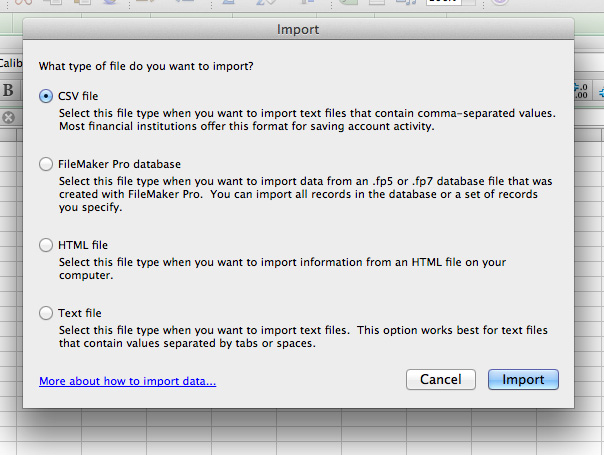
It will ask you: What type of file do you want to import? By default it has selected the CSV format but let's select the text file format since our program saved this to a text file.


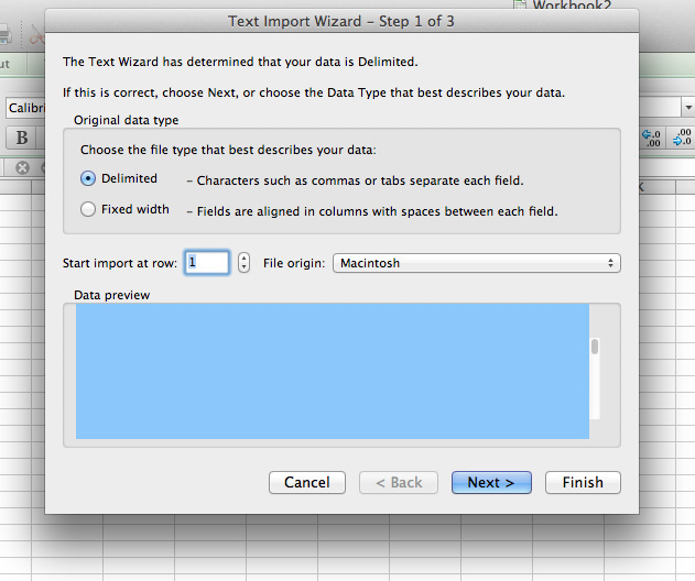
Now, click the file that you want to open and click on "Get Data." The text import wizard will pop up showing you settings to choose from. Select the "Delimited" option unless it is already checked by default. Then click on Next.


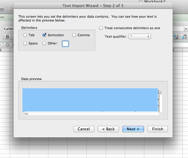
In this step you can set the delimiters that your data contains. Remember when we selected the semicolon back while importing our file? Select the semicolon option here. Then, let's click on next.


Here, we can set up our columns and set the data format. For our purposes, however, let's just go with the default options.


Now, it will ask you where you want to put the data. You have a choice of Existing Sheet (which starts at =$A$1), new sheet, and pivot table. For the purposes of this article, let's just go with the default and click on OK.


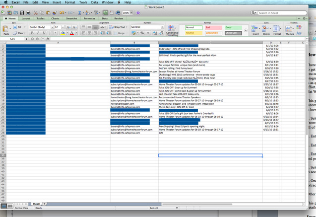
Here, you see we have perfectly aligned columns and data without much work. Now you can move forward with formatting these columns and data in whatever orientations or pivot tables you like.


How to download leads from Outlook to Excel


For those who use Outlook, depending on your version, it can be cumbersome to get the data out of the program and can take longer than in just about every other program. Thankfully, Outlook features macros which can be used to export all of your data in the span of just a few seconds!


Step 1: Find or create the macro script you want to use


There are a ton of options and configurations available for this task. For our purposes, we will use modified versions of the scripts located here.


Before we get started, we will need to get the basic code from the very first code snippet, shown below. This code only exports the Subject, Received Time, and Sender of the email message. Our goal is to modify this script so that our new code will extract the entire body of the message and output it to the spreadsheet as well. Don't worry! I am going over each line of code that we modify in this tutorial! This way, you will understand exactly what we are doing and why.


Sub ExportMessagesToExcel()
Dim olkMsg As Object, _
excApp As Object, _
excWkb As Object, _
excWks As Object, _
intRow As Integer, _
intVersion As Integer, _
strFilename As String
strFilename = InputBox("Enter a filename (including path) to save the exported messages to.", "Export Messages to Excel")
If strFilename <> "" Then
intVersion = GetOutlookVersion()
Set excApp = CreateObject("Excel.Application")
Set excWkb = excApp.Workbooks.Add()<br> Set excWks = excWkb.ActiveSheet
'Write Excel Column Headers
With excWks
.Cells(1, 1) = "Subject"
.Cells(1, 2) = "Received"
.Cells(1, 3) = "Sender"
End With
intRow = 2
'Write messages to spreadsheet
For Each olkMsg In Application.ActiveExplorer.CurrentFolder.Items
'Only export messages, not receipts or appointment requests, etc.
If olkMsg.Class = olMail Then
'Add a row for each field in the message you want to export
excWks.Cells(intRow, 1) = olkMsg.Subject
excWks.Cells(intRow, 2) = olkMsg.ReceivedTime
excWks.Cells(intRow, 3) = GetSMTPAddress(olkMsg, intVersion)
intRow = intRow + 1
End If
Next
Set olkMsg = Nothing
excWkb.SaveAs strFilename
excWkb.Close
End If
Set excWks = Nothing
Set excWkb = Nothing
Set excApp = Nothing
MsgBox "Process complete. A total of " & intRow - 2 & " messages were exported.", vbInformation + vbOKOnly, "Export messages to Excel"
End Sub
Private Function GetSMTPAddress(Item As Outlook.MailItem, intOutlookVersion As Integer) As String
Dim olkSnd As Outlook.AddressEntry, olkEnt As Object
On Error Resume Next
Select Case intOutlookVersion
Case Is < 14
If Item.SenderEmailType = "EX" Then
GetSMTPAddress = SMTP2007(Item)
Else
GetSMTPAddress = Item.SenderEmailAddress
End If
Case Else
Set olkSnd = Item.Sender
If olkSnd.AddressEntryUserType = olExchangeUserAddressEntry Then
Set olkEnt = olkSnd.GetExchangeUser
GetSMTPAddress = olkEnt.PrimarySmtpAddress
Else
GetSMTPAddress = Item.SenderEmailAddress
End If
End Select
On Error GoTo 0
Set olkPrp = Nothing
Set olkSnd = Nothing
Set olkEnt = Nothing
End Function


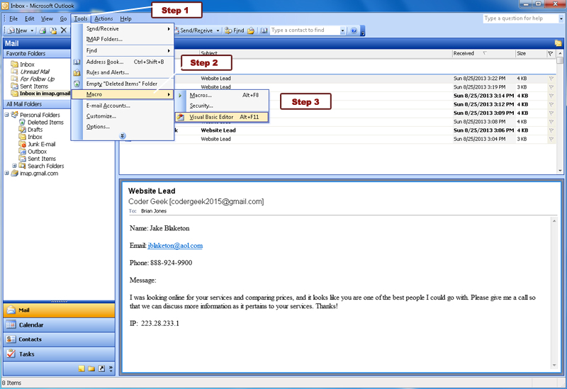
In order to get started, fire up your version of Outlook. I'm using a relatively old dinosaur version (Outlook 2003), but the steps can easily be found online for all versions. Most Windows versions should allow you to use Alt+11 to open the Visual Basic code editor, which we are going to fire up next. To do this, follow these steps:


Step 1: Click on Tools.

Step 2: Click on Macro.

Step 3: Click on Visual Basic Editor.


Next, we are going to copy and paste our code here into the editor window. Now, I used the revision 1 script and modified the original version to extract text from the body by coding the following lines. One after line 19, and one after line 29:


.Cells(1, 4) = "Message" <-- This line tells the macro program to add another column to the first row that is labeled "Message". This will add a new column that displays the text extracted from the email. This one was added after line 19.


.excWks.Cells(intRow, 4) = olkMsg.Body <-- This line tells the macro program to extract the message text from the Body of the email. This way, we have an extremely easy and fast method of verifying all of our important conversion emails that we are going to be using in our reporting.


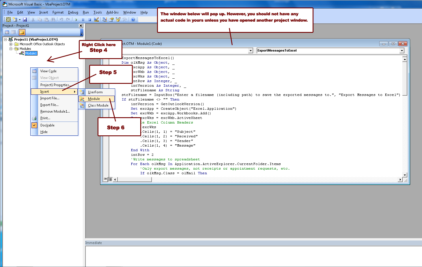
Now that we have our script ready, let's go to the Visual Basic macro editor.


In the project window underneath the project, right-click within the window, click on insert, and then click on module. This will bring up a VbaProject.OTM file that you can add your code into, as shown in the following screenshot:


Once you have made your desired modifications (or if you desire to use the original script and copied and pasted it, just click on the floppy disk in the upper left hand corner and save the file. Or you can use Ctrl+S to save it. Then, close the Visual Basic editor.


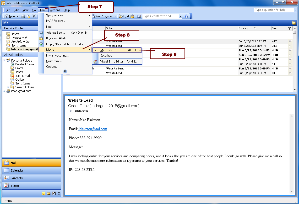
Next, we're going to run our newly modified macro! First, make sure the folder that you want is selected and all the leads you want to export to an excel spreadsheet are in that folder. Then, let's click on Tools > Macro > Macros.


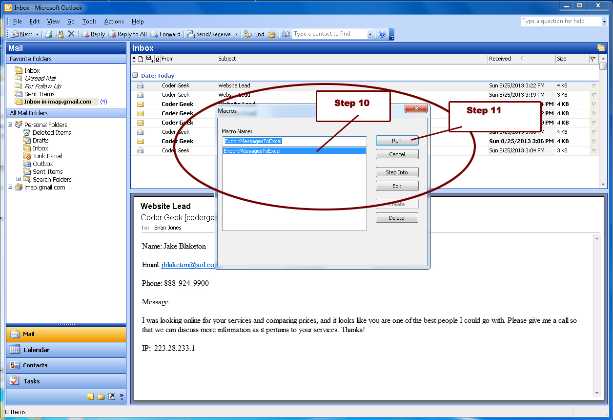
Next, you will see a Macros window pop up. We need to click on the macro we want to run, and then click on run.


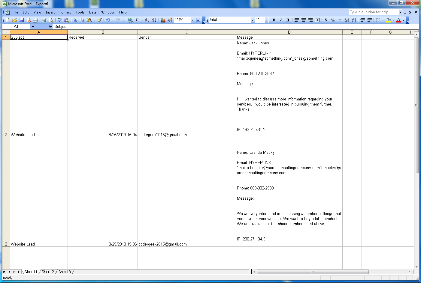
True to the nature of the script, you will be prompted with a dialog box that asks you what you want to name your file. Let's call it "ExcelExportTest". It will save it into your My Documents folder. Fire up Excel, and open your brand new spreadsheet. Here is the final version of our example, complete with all extracted elements of that folder:


Wrap-up


By using these methods, it is possible to greatly reduce the time that you spend on manually verifying and copying/pasting leads from your email box. It will be completely automated! Once you get the hang of using these methods, most of your time will be spent in the formatting phase that comes next. So, it will be necessary to spend this time adding some proper formatting that will help make your reports beautiful and impactful.


Sign up for The Moz Top 10, a semimonthly mailer updating you on the top ten hottest pieces of SEO news, tips, and rad links uncovered by the Moz team. Think of it as your exclusive digest of stuff you don't have time to hunt down but want to read!


from Moz Blog http://moz.com/blog/automate-seo-reporting-export-leads-into-excel

Was There a November 14th Google Update?

Posted by Dr-Pete


On the morning of Friday, November 15th, we woke up to a substantial one-day temperature spike on MozCast. Digging in, there were no signs of a glitch, and it seemed to hit across multiple IPs. The 30-day history looks like this:


Webmaster chatter seemed normal and Google has not confirmed an update, but soon other major flux-tracking tools showed one-day spikes. Here's the data from SERPmetrics:


Both SERPmetrics and SERPs.com (that graph is a bit less clear, due to an unusually low-flux day earlier in the month) show the spike on November 15th, but one-day shifts are common due to measurement differences in the three tools.


Did big sites win big?


The first thing I dig into when we see a temperature spike is a set of secondary metrics that look at large-scale trends across the data set. That morning showed a solid jump in the "Big 10," which simply represents the percentage of total search results in the set occupied by the top 10 domains (for that day):


The one day jump from 15.39% to 15.89% represents a 3.2% relative increase – it may not seem like a huge amount, but it's historically unusual. Wikipedia, Amazon, and eBay all had one-day gains in the 3-5% range.


Unfortunately, it's easy to jump to conclusions but much harder to interpret this kind of change. Some algorithm updates might benefit large brands, but it's just as often the case that an update penalizes low-quality sites, and the big brands simply end up filling the gaps. For example, if the #10 result on a SERP falls out, and the #11 pops up one position to fill that spot, the new #10 is more likely to be a big site with a large Google footprint than a small site.


Our larger data set (not currently public) set shows a similar trend. All I can say with certainty is: (1) this was a historically unusually one-day change, and (2) the "Big 10" metric is at now at a historical high (going back to April 2012). I have no reliable clues about the causality and what specifically changed to cause this increase.


What did Wikipedia win?


Since digging into high-temperature keywords didn't reveal any clear patterns, I thought it might be interesting to see where a big winner (like Wikipedia) picked up top 10 listings. In most of the cases I saw, the big domains didn't gain prime real estate, but simply picked up a top 10 result because another site fell out. For example, here are the top 10 on November 14th for "famous footwear store hours" (domains only):


  1. FamousFootwear.com

  2. FamousFootwear.com

  3. FamousFootwear.com

  4. FamousFootwear.com

  5. FamousFootwear.com

  6. FamousFootwear.com

  7. FamousFootwear.com

  8. MyStore411.com

  9. Wiki.Answers.com


Clear, this SERP was dominated that day by the main brand's site (in this case, individual store locations). On November 15th, though, it appears there was a shuffle in domain crowding:

  1. FamousFootwear.com

  2. FamousFootwear.com

  3. FamousFootwear.com

  4. FamousFootwear.com

  5. MyStore411.com

  6. Wiki.Answers.com

  7. OutletLocation.com

  8. Indeed.com

  9. Wikipedia.org

  10. Yelp.com


The main brand's site dropped from eight results to four, and Wikipedia simply picked up one of the newly opened spots. This domain crowding/diversity pattern didn't seem to hold up across the data set, but it does appear that the gains by big domains were primarily due to losses higher in the SERPs. In other words, big domains like Wikipedia and Amazon only picked up top 10 rankings because someone else fell out.

Was there a glitch?


Something else happened on November 14th that was a bit odd. I informally polled my Twitter followers about that day and got the following bit of information from Galen Ward:


Coincidentally, I had just been in the Moz Google Webmaster Tools account that morning and happened upon this (I didn't put two and two together until Galen's tweet):


I didn't think much of it at the time (temporary glitches happen), but it seems that multiple webmasters and SEOs got the same error on the same day. Is it possible that a bug on Google's end could cause large-scale ranking fluctuations? It depends a lot on the scope and nature of the bug. Last April, a Google bug caused a number of domains to be misclassified as parked, and the impact was large enough to cause noticeable ranking changes.


If this was simply an unexpected side effect of a bug, though, we'd expect a reversal. The temperature the next day or soon after would spike again, and the secondary metrics, like the Big 10 increase, would settle back to their former values. In this case, we've seen no such reversal.


Is Andy Kaufman alive?


When it comes to daily ranking changes, separating the signal from the noise is incredibly difficult. The morning of November 15th, we captured a change that illustrates just how dynamic Google has become (and is something I've wanted to capture in the wild for a while).


Around November 13th, TMZ broke a story that a woman claiming to be Andy Kaufman's daughter said that her father was still alive. Multiple news sources picked up on this story on November 14th. Early that morning, we captured the first page of results for "kaufman", which were as follows:


  • IMDB (Charlie Kaufman)

  • Wikipedia (Kaufman, TX)

  • Wikipedia (Andy Kaufman)

  • RobertKaufman.com

  • KaufmanCo.com

  • KaufmanCounty.net

  • KaufmanTX.org

  • Kauffman.org

  • Fandango.com (Kaufman Astoria Cinemas)


Google was viewing a search for "kaufman" as informational and generic, returning results for Andy Kaufman, Charlie Kaufman, cities named Kaufman, etc. A disambiguation box on the SERP even makes it clear that Google has trouble interpreting the query.


After the story about Andy Kaufman broke, the SERP changed dramatically:


  • CNN

  • IMDB (Charlie Kaufman)

  • CNN

  • Wikipedia (Kaufman, TX)

  • Fox News

  • KaufmanCounty.net

  • RobertKaufman.com

  • KaufmanCo.com

  • US Today

  • NY Daily News


Where there were no news-related organic results before, news articles now accounted for half of the top ten, including the #1 and #3 spots. You may have heard the term "QDF" (Query Deserve Freshness) in the SEO world. What's interesting here is that QDF is not something that's just on or off for any particular query. A query that was relatively static transformed overnight because of new information. In other words, Google decided in real-time that this informational query was now a news query, simply based on new data and content.


Is this the cause of the overall flux? No – it's very unlikely that a single event could move the needle. Even an event like 9/11, that had a huge impact on many people, is only going to be relevant to a small percentage of queries. Events like these simply go to show how dynamic any given query can be on any given day. In a case like this, the query isn't even historically high flux – it transformed overnight, and that transformation had nothing to do with algorithm updates.


So, what happened?


If it seems like I'm stalling, then, well – hey, is that Elvis?! One of the difficulties of retroactively explaining rankings fluctuations is that we typically can only look at the results themselves. This essentially means that we're measuring positions, position changes, and characteristics of the domains and URLs. This makes it easy to measure something like domain diversity but very difficult to profile something like a Penguin update, where the changes are due to characteristics of the individual sites and their link profiles.


We're also creeping into the holiday season – we've already seen a pattern of above average flux in the weekend before Thanksgiving. As we get into Black Friday, commercial SERPs naturally fluctuate, and it's hard to separate what Google is doing from changes due to competition and seasonality.


Whatever happened on November 14-15, it doesn't appear to have rolled back. The one-day spike is similar to a more traditional algorithm update, but that's about the best we have for now. If anyone has seen additional clues or has any follow-up on the DNS errors in Google Webmaster Tools, please leave a comment.


Sign up for The Moz Top 10, a semimonthly mailer updating you on the top ten hottest pieces of SEO news, tips, and rad links uncovered by the Moz team. Think of it as your exclusive digest of stuff you don't have time to hunt down but want to read!


from Moz Blog http://moz.com/blog/was-there-a-november-14th-google-update

Remarketing: How to Make Your Content Marketing and SEO up to 7x More Awesome

Posted by larry.kim


Today, I'll share with you a case study on how we used remarketing to make our content marketing and SEO efforts up to seven times more effective. In the last two years, we've moved beyond just doing SEO to kicking some major online marketing butt and I'd love to show you the lessons we've learned in the time it took to get here. Hopefully you can cut your own learning curve and get right to it!


Rockin' SEO and the company no one knows


WordStream's website launched late in 2008. My company is pretty much your typical B2B brand using content marketing and SEO to drive leads for the business. Today, our blog gets around half a million visitors each month; we've seen a compound monthly growth rate of 8.4% every month, for the last five years!


Here's what that looks like:


At first glance, you might consider this a huge SEO success (doesn't everything look better if you only take a glance?). As you might expect though, we've faced a few challenges over the last few years:


Issue 1: Low visitor engagement


Here's what it looked like over a 60-day period last year, back when we had pretty weak user engagement metrics:


  • Just 1.9 pages per visit.

  • An average visit duration of 1 minute and 34 seconds.

  • A new visitor ratio of 79.2%.


We knew we could do better than this… yet we weren't.


Issue 2: Low conversion rate


Our second challenge had to do with low conversion rates from website visitors to offer sign-ups. Like many other companies that do SEO/Content Marketing, we're hoping to turn some of that traffic into offer sign-ups for things like white papers or free trials. We want to get interested prospects into our system so we can communicate with (and market to) them on a regular basis.


Unfortunately, our conversion rates were pretty low--just under 2%--as people were bouncing away and often not returning. I don't care how great you are at getting eyes on your content; if you're not converting, it's worthless.


Issue 3: Virtually no branded searches


This one was probably our biggest problem. In organic search, only 3% or so of our approximately half a million monthly organic searches were branded searches. Check out this snapshot from last year, back when "not provided" was only around 10% and it was still possible to do this kind of analysis.


(Let's just stop here briefly, shall we? We must have a moment of silence for our lost organic keyword data.)


Okay, we're back… have a look:


I'm sure we've all seen our share of clueless clients, where 95% of the organic search traffic is branded search. I wouldn't want to see all branded search; it means your SEO sucks if you're only appearing in front of people who are already looking for your business by name.


My site was the exact opposite. We were driving hundreds of thousands of visits per month via SEO and only 3% of that came from branded search. What does that mean? It meant our SEO had gotten too far ahead of the brand.


On the one hand, it's great to have growing SEO traffic numbers. However, as I pondered the issues above—low engagement, low conversion and very little branded search—I realized the situation was more like:


the best internet marketing company that nobody ever heard of


(image via Flickr)


Essentially, we were just driving tons of traffic to my link-juiced up domain using the amazing, optimized content we'd created, but people wouldn't stay that long, convert, or remember the company brand.


That's not a good thing at all. It's pretty anti-climactic, actually; you do the work of creating killer content, optimizing it for both users and search, get it out the door and in front of the right people… and they still have no idea who you are. We had to stop throwing money out the door. We couldn't just be SEOs anymore.


Remarketing primer for the uninitiated


Remarketing is basically the process of tagging people who visit your site, then targeting them with banner ads after they leave your site. No, this is not otherwise known as stalking—not if you're doing it right, anyway. Remarketing can be a very powerful tool, if you avoid crossing over into the creep factor.


How Remarketing Works


It gives you the opportunity to appear in front of people who had already expressed an interest in your brand as they go about their business on the web. They could be checking their email, reading the news, watching a YouTube video… and there you are! Reminding them of that thing they were going to do when they checked you out a few days ago.


Why remarketing?


We did a lot of thinking about our issues and how to fix them. We were totally killing it with our SEO and driving traffic like no one's business, but clearly, that wasn't enough.


Remarketing was actually one of the first potential solutions I considered seriously, because by definition, remarketing provides opportunity to:


  • Turn abandoners/bouncers into leads

  • Increase brand recall (and thus increase branded searches)

  • Increase repeat visitor rates and engagement

  • Increase the effectiveness of SEO and content marketing


What we needed was to better connect with the people who were interested in visiting us in the first place. Obviously, we weren't excelling at grabbing and keeping their attention, but then, we weren't getting the chance to follow up with this mass of search traffic.


Remarketing would allow us a second chance to make that first impression, if you will (and even a third, and a fourth). We had to get past being forgettable. We had to get sticky.


And why remarket with Google, you ask? Why not? Quite simply, they were the largest and most recognized marketplace going; they just made sense for us. The Google Display Network is one of the largest remarketing networks in the world, with over two million sites in the network. It also includes AdMob for mobile targeting, meaning you can get your ads to show up in Angry Birds and other mobile apps.


the reach of the Google Display Network


Generally you can find your tagged site visitors on the network many times per day, several days per week, and across many different sites. On average, you'll be able to connect with:


Soon, Google DoubleClick users will also be able to buy retargeting ads on Facebook, which is proving an incredibly effective platform for the tactic.


Remarketing as a Conversion Rate Optimization Tool


According to research from Forrester, 96% of people who visit your site don't convert to a lead or sale. And 70% of people who put stuff in a shopping cart leave without placing an order. These people really are the low hanging fruit and from that perspective, I view remarketing as an effective conversion rate optimization tool—sort of.


average conversion rates


This was another major reason retargeting made sense for us. We really needed that help with brand recognition and getting people back to our site to convert (or at least get back on site and connect so we could nurture the lead).


So, with the decision made to at least try it out and test, we got started.


Important things to consider when starting remarketing


In remarketing, you usually need to create different audiences to remarket so you can adjust your bidding strategy and your ads. For example, we created one audience for people who visited our blog, one for home page visitors and another for people who visited one of our free tools (e.g.: Our Google AdWords Grader for PPC auditing). We can assume each of these high-level groups was looking for different types of information.


This basic segmenting allowed us to show different ads, depending on which section of our site they visited.


A secondary benefit was that we could bid more aggressively (get more impressions, higher more prominent ad positions) for visitors to our AdWords Grader, which is worth way more to us as a business than someone who visits our blog (because we blog about all sorts of random stuff that has nothing to do with WordStream there, intent is far lower, if at all).


Another cool remarketing strategy for content marketers is to define audience categories based on the different post categories in your blog. If you already have a ton of blog content that is classified by topic, leverage those existing classifications in your remarketing audience definition strategy.


Also, consider membership duration; that is, how long do you want to keep chasing these people around the Internet? I set ours to 30-60 days, which is pretty aggressive (you might even call it spammy). A shorter membership duration would improve cost per conversion metrics, since people are less likely to convert as more time passes. Also, consider the difference you might see between B2C and B2B. You know the length of your average sales cycle and will have to test to see if it's worth going beyond that time, or if they're apt to have completed a purchase.


Remember:


  • Create audiences, groups of visitors based on the pages they visited or other factors.

  • Bid more aggressively on visitors who showed greater intent.

  • Segment your audiences based on the different content topics on your site

  • Test against the length of your sales cycle as a starting point to finding the right audience membership duration.


Killer ad creative strategy for remarketers


Now that we've tagged visitors and segmented them into different audiences, the key is to create cool ads in different formats that:


  • Drive a call to action.

  • Feature branding or images that will improve brand recall.


Lousy ads have sunken many remarketing efforts, so the key is to keep A/B testing with different ad designs. You want to have a high CTR (ideally more than 0.4%) and find the most memorable copy and image combinations, since one of the objectives here is to improve brand recall. You know you have finally "made it" when you get people tweeting your ads! Like this cute little puppy dog!


Another company killing it with their remarketing ads right now is none other than Moz, who has some of the cutest remarketing ads featuring the amazing Roger Mozbot!


Remarketing results 18 months out


We started our remarketing efforts early in Q1 2012, just over 18 months ago. How are things going today? Based on the title of the post, you know this was the best move we could have made, but how big was the impact?


Impact on brand recall


One of the biggest issues I had was poor brand recall - that a measly 3% of my organic searches were branded searches. Unfortunately, the whole keyword (not provided) mess makes it pretty much impossible to trend this branded searches over time [shakes fist at Google], however a proxy for brand recall is direct traffic. Meaning, to the extent that you're building your brand, you would expect more people to visit your website directly, as opposed to stumbling upon your SEO'ed content. Here's what my direct traffic looks like over last 6 years.


Impact on repeat visitor rate


Earlier, I mentioned that last January, we had a 20% returning visit rate. Today, it's more like a 33% of our visitors are repeat visitors. That's a massive over 50% improvement. We love to see the steady increase in repeat visitors (decrease in new visitors) over time.


Impact on user engagement and conversion rates


Check THIS out. Remember that ridiculous 1 minute and 33 second average visit duration? Today, it's up 300% and is approaching 5 minutes. Furthermore, our website visitor-to-lead-form-submitted conversion rates are up 51%!


It's important to note there was one other major factor that helped us here with the huge increase in visit duration and that was to embrace longer form content. Both were important for the overall strategy and I'll write about that in a future post.


Repeat visitors +50%, conversion rate +51%, and and time on site +300% = 7x more awesome!


A few closing notes on our remarketing strategy:


Basically, we buy a truckload of impressions ever month. Around 44 Million of them per month—take a look below—I allocate my PPC budget 50/50 between search and display remarketing.


Why so much remarketing? At this point, we're already generating hundreds of thousands of visitors to the site every month via SEO and content marketing, so it's worth that much more to the business to convert the organic traffic we're getting. I think this is very common among sites that do SEO well.


As we've gotten better and better at driving traffic via SEO, our PPC search strategy today is much more about getting additional ad space coverage around a very narrow set of high commercial intent keywords, which have lots of ads crowding out the organic results.


It's important to note that my "7x More Awesome" metric was our ROI from remarketing as we specifically sought to improve engagement rates, brand recall and conversion rates - if you choose to test remarketing for your business, the ROI will depend on your goals and objectives.


Remarketing: moving beyond SEO towards building your brand


In summary, SEO is a great traffic acquisition method, but by definition, you're going after people who are unfamiliar with your brand (since if they knew where to get whatever they were looking for, they would have directly navigated to your site).


In order to grow your business into a more mature company, you need to go beyond just SEO and build your brand!


Remarketing is an incredibly effective way to leverage and capitalize on your SEO and content marketing investments to build:


  • more repeat visitors,

  • more brand recall (branded searches, direct traffic),

  • more engagement (pageviews per visit, time on site, lower bounce rates)

  • and more conversions/leads/sales.


Personally, I think it's crazy to be doing SEO without at least some remarketing. No, it's not free, but neither is SEO/Content Marketing. The point is to understand where each tactic is most effective and how they work best together to drive audiences, then convert/retain to get way more bang for your buck. Like Rand has said, we can't just be SEOs anymore!


Sign up for The Moz Top 10, a semimonthly mailer updating you on the top ten hottest pieces of SEO news, tips, and rad links uncovered by the Moz team. Think of it as your exclusive digest of stuff you don't have time to hunt down but want to read!


from Moz Blog http://moz.com/blog/remarketing-how-to-make-your-content-marketing-seo-up-to-7x-more-awesome

9 Lessons from an $11m Marketing Campaign

Posted by jamesporter


The John Lewis Christmas 2013 campaign has smashed it virally. Since it launched two weeks ago it's had:


  • 8 million views on YouTube

  • 150k Twitter mentions

  • 70k Facebook interactions


As content marketers, those kind of engagement statistics seem incredible. Admittedly, brand marketers have much bigger budgets, but as content marketers, what can we learn from brand marketers about creating, launching and promoting content?


If you're in the UK, then you will undoubtedly have seen it, but for everyone else, here's the video:


If you're a bit skeptical and think that content marketing and big brand marketing are totally different, then read this quote from industry marketing bible The Drum:


"Shares are the currency of social success and for leading brand marketers discovering how to create and distribute highly shareable content repeatedly and at scale is now at the top of their wish list."

Sounds familiar, right? Basically big brand marketing and content marketing are converging.


Hopefully you've bought into the idea that we're becoming the same industry…so what can we learn?


Lesson 1: Don't launch on your own site (launch where your target market is)


John Lewis is a big brand, but they didn't launch their campaign on their site. They launched their campaign via Twitter and YouTube.


Why? Because that's where their target market is, that is where they are going to get traction with their audience, and that is where they have the highest chance of virality.


Lesson: Could you launch your content where your target market is? A great example of this happening in the SEO community is Stephen Pavlovich's Definitive Guide To Conversion Rate Optimisation. It's a fantastic piece of content that was launched on Moz and helped to build Stephen's name in the industry.


Pro Tip 1: If you're worried about losing link equity, use the cross domain rel=canonical tag to transfer value back to your site.


Pro Tip 2: If you can't get your content onto a platform where your target audience is, can you use paid promotion to get your content on there?


Lesson 2: Don't make links your main objective


We all want more links. But at Distilled we're now optimising campaigns for other metrics as well.


Question: Would you rather build your brand with new audiences or would you prefer a link from a DA30 site on a page that nobody ever visits and that provides zero referral traffic?


Lesson: Set your content objectives not purely on links or views, but on other levels of engagement. Still factor in links but consider other metrics like sharing, data capture, brand uplift, or online purchases/enquiries.


Lesson 3: Target your content broadly


When you're creating content at the level of John Lewis, then arguably your audience is the entire population.


As content marketers, we've got narrower audiences, but there's a fine line between targeting your content too broadly:


and targeting your content too narrowly:


Lesson: Make sure that the audience that you are targeting for your content piece is large enough to achieve your objectives. Otherwise you have failed from the start.


Pro Tip 1: If you're worried about the reach of your target audience, try and combine several audiences into one content piece. Wiep Knol in his Searchlove 2010 presentation (no longer available, unfortunately) gave a great example of combining several target audiences with his piece the "70 Most Beautiful Churches In Europe," which brought the travel blogging and religious communities together.


Pro Tip 2: Another way you can target content more broadly is geographically. Bingo site TwoLittleFleas has used a US/UK switch on their quiz to broaden their potential audience from 63m (UK population) to 377m (US and UK population).


Pro Tip 3: Another way of targeting your content is including many niche audience groups within a piece of content. This works as the piece of content speaks to pre-existing communities, and their automatic thought when seeing the piece is "that's for me!."


The "From Gospel to Grunge: 100 Years of Rock" piece is not just for people interested in music, it also references various music communities and that will encourage people to engage with the piece.


100 Years Of Rock


Lesson 4: Build influencers into your content


John Lewis has embedded an influencer with a massive online community directly into their content. Lily Allen is singing on the ad, which is a pretty clever play from John Lewis considering that she's got 4.3m followers on Twitter.


Lesson: Build influencers into your content launch plan. Ask them to contribute or comment, give them a free trial, or offer them beta access.


Pro Tip: When doing outreach, find people who you can help out. This changes the mindset from "what can this person do for me" to "how can I help this person" (great tip from Marco Montemagno at SearchLove 2013).


Lesson 5: Focus your marketing on innovators/opinion leaders


Hat tip to Seth Godin (and his Purple Cow) for this one. Why did John Lewis launch their campaign online, even though TV is the primary channel? Because online is where innovators and opinion leaders hang out. These are the people that are on the lookout for something new or different. Innovators and opinion leaders have the ability to change the behaviour of the early and late majority.


Lessons: Opinion leaders matter. Use this process from Richard Baxter to find the influencer intersect for your market, and then build relationships with these people as a long term strategy for success in your space.


Lesson 6: Get your creative right (people need to love your marketing)


Didn't you know? Google and other social networks (particularly Facebook), are filtering content through to you based on what they think you'll like. Just because you're publishing content doesn't mean your audience is getting it. (not convinced, read this book).


If other people are reading and sharing though, then your content is likely to get through the filters. So people really do need to love your marketing for it to work.


So, how can you get your creative up to scratch?


If you're just starting out with content marketing, then there are a few things you need to do first:


  • Manage expectations and educate internally that content marketing plays like this can fail.

  • Do something small first that requires limited budget. Build confidence. Get buy in from the C-suite. THEN go big!


Pro Tip 1: Mitigate risk. Offset some of the risks of content marketing by emulating the fundamentals of a piece that has ALREADY been successful in a different geographical location or industry.


Pro Tip 2: Need creative inspiration? Check out this great post from Kelsey Libert on creative ideation, or this classic from Larry Kim "How I got a link from the Wall Street Journal".


Lesson 7: Spend more on outreach than you are spending on content creation


The John Lewis campaign cost £7m. £6m is going to promotion (advertising). £1m went to creative.


What ratios are you working on in terms of spend on content creation to outreach? The loud and clear message here is that in brand marketing outreach isn't an afterthought. It's fundamental to the campaign.


Lesson: Double your outreach budget. Do outreach yourself? Spend twice the amount of time on it for your next project.


Lesson 8: Keep your content non-promotional (but plan for sales post-launch)


If people feel that they are being sold to, they are less likely to share. So keep your content as non-promotional as possible.


Lesson: For your next piece of content, strip out your sales focused header and footer, and remove the sales spiel and the 'buy' call to action. This is an example piece of content marketing for Simply Business. As you can see, the content, sharing and utility of the piece is the main focus, not any specific marketing or commercial messages.


Pro Tip: Add remarketing tags to your content so you can promote to your audience at a later date (even if it's just to promote your next content piece).


Lesson 9: Are you creating a reaction with your audience?


What reaction are you stirring up in your audience? Is it curiosity, surprise, sorrow or pride?


Interestingly, John Lewis adverts are deliberately sad and they evoke an emotional reaction with their choice of music and the story.


Lesson: At the concept stage, if your concept doesn't evoke a visible reaction with a small group of users, consider it a no-go. No reaction = No social shares.


Conclusion


As content marketers, we know a lot of the strategies and tactics that brand marketers are using. But there's a big difference between knowing what to do, and actually doing it.


In my opinion, there's still a lot we can learn from brand marketers, specifically in terms of strategy, scale, reporting and measurement, and ultimately in the results they get. I'm excited about the way that our two industries are converging.


If you need more inspiration here are a list of resources that I follow to keep up to date with the creative digital sector, and of how I keep up to date with what people love online:


Ads/PR/content making waves:


Hope you enjoyed the piece, if you've got any examples of great content marketing or brand marketing that have blown you away, drop them in the comments. Would love to see them.


Sign up for The Moz Top 10, a semimonthly mailer updating you on the top ten hottest pieces of SEO news, tips, and rad links uncovered by the Moz team. Think of it as your exclusive digest of stuff you don't have time to hunt down but want to read!


from Moz Blog http://moz.com/blog/9-lessons-from-11-million-dollar-marketing-campaign

Web Psychology - Whiteboard Friday

Posted by nathalienahai


All marketers hope to see their audiences move down their marketing funnel, eventually converting to paying customers. We reach out through social media, we create content that we hope resonates, and we optimize our sites in hopes of eliciting certain behaviors from those customers. Psychology, then—the study of mental functions and behaviors—is a foundational part of what we do.


In today's Whiteboard Friday, Nathalie Nahai—the web psychologist—explains some of the more fundamental aspects of people's behavior online, offering insight into ways we can improve our efforts to reach them.


For reference, here's a still of this week's whiteboard!


Video Transcription


Hi everyone. My name is Nathalie Nahai. I'm the web psychologist, and today I'm on Whiteboard Friday. So I'm going to be talking with you about web psychology, which is a term that I coined in 2011 to describe the empirical studies of online behavior.


It draws from various different fields. It's a point of convergence for any type of research that looks at online behavior, so things like human-computer interaction, cross-cultural psychology, which is a very, very interesting area, social psychology, how we relate to other people both in groups and on a smaller level, advances in neuroscience, how we can use neuroscientific studies to tell us about how we respond online at a brain-activity level, and as a subset of that, neuroaesthetics, so to visual stimuli. We also got cognitive psychology and things like attention online, that tends to be quite limited, and how to make the most of that attention, and also behavioral economics, which looks at why we behave in seemingly irrational ways online.


All of these different disciplines and many more give us different glimpses into how online behaviors are shaped and can be affected.


In the research for all of this, it was actually for a book that I wrote called "Webs of Influence," which is looking at the psychology of online persuasion. In all the research that I did, I found that there were three key things that you had to be able to do or to think about and to act upon in order to be successful online.


So there are three secrets to online success. The first is to know who you are targeting. The second is to communicate persuasively, and the third and final one is to sell with integrity. So I've broken these down a little bit so that we can have a little look at some of the elements that make up these three pillars.


So let's start with number one—know who you are targeting. It's really, really important that you research your audience, especially if it's an audience that you think that you're familiar with, because doing research will uncover things that will always surprise you. So I like to start with the most basic of things or the most complex of things, which is the human brain.


What systems are we engaging online? I like to think of it in a metaphorical sense. So you have the logical, which is where we like to think we make decisions, the emotional, which is where we actually seem to make decisions, and then the primal, which is freeze, fight, and flight, sex, food, motion, it's the thing that keeps us alive. So we start with a human brain, and if you have an understanding of how we work, then you can start looking at the psychology of decision making. How do we make decisions, both on and offline? How does that influence what we end up doing versus what we say we might do.


You also then have to look at who's online and why they're there. It's not enough to have an idea about just the people that you think you might like to target. But broaden your scope. Who else is on there that you think would be interested in what you have to say?


Once you've figured out who's online and why they're there, figure out who you specifically are targeting, and you have to narrow this down to make sure that you have a clear enough idea of the persona or personas that you're trying to engage.


Once you've narrowed it down to that point, you have to look at two really key things. Number one, the cultural context of that audience. So are they from a culture that is very high in collectivism or in power distance, the degree to which we accept and expect unequal power distribution? If you're interested in that, there's some fantastic research by a guy called Geert Hofstede, who is a professor of psychology who spent 40 years looking at cultural dimensions. You can find him online. So looking at the cultural context of your audience and then their individual psychology.


So things like individual psychology can mean their gender, personality traits. If you're going to look into personality, check out the big five, the five factor model. It's a lot more accurate than the other models typically. Also things like age, you can also look at the types of clusters of traits that they exhibit in terms of the preferences for online platforms, behaviors. You can really go to quite a strong degree of granularity on that one.


So that gives you a quick overview of some of the elements in section one of knowing who you are targeting.


The second pillar, to communicate persuasively, it really rests on the idea that we tend to prefer to engage with and trust people who are able to make us feel like we have a connection. That's a no-brainer. Research has shown that there is a subset of motor neurons in the brain, called mirror neurons, that activate when you see someone else doing a particular action.


So if I suddenly had my arm chopped off, hopefully if you're empathetic, your mirror neurons would kick in, and you would hopefully feel a sense of wince or pain in sympathy with me. The reason I'm telling you this is because to communicate persuasively, you have to trigger other people so you can literally get on the same wavelength. If you can do that, you'll be able to convert much more effectively.


So there are different ways in which you can approach this. Most of you might be familiar with Maslow's hierarchy of needs, so things like safety, physical safety, food, shelter, love, all the way up to self actualization. There are ways in which you can help people to achieve these things online. You can do it through all these different elements—your website, your images, your videos, your color, and your social work.


Websites, very interesting, you've got a huge amount of stuff that influences how people react to you on the website. Things like the fact that we will subconsciously scan a new website for cues as to whether or not we can trust that site when we first visit. These can be things such as padlocks, showing that your information will be secure. It can be things like authority figures endorsing your website.


It could also be stuff that moves into the realm of colors. In color psychology, there are two main colors that seem to have fairly universal effects on the human psyche and emotional state, and that's red and blue.


Red tends to be very high arousing, raises up our heart rate, and it makes us a bit more stimulated. Blue tends to have a similar but opposite effect. So the opposite effect is that it calms us down. We feel like we can trust the person whose site it is, which is probably also why the Fortune 500 and financial sectors use blue typically as their main brand colors, because it calms us down.


Another weird fact about blue is that it kind of warps our perception of time. So if cultural audience is based somewhere that has very low Internet speeds, make your color blue, and they will perceive the speed of the website as loading more quickly.


Videos, things like body language are very, very important. Having a more open, natural, slightly more expansive body language can be quite useful. Again, you've got to check that against culture. The images should always reflect the audience that you're trying to reach. So I'm going to use a London example. If you're looking at reflecting Shoreditch hipsters in East London, then you would want to use people in your images and your videos that reflect those traits. So the kind of jackets that they use and the metro look and the rest of it.


I'm not going to go into social right now because its way too complex and it would take forever. But you get a sense of some of the things that are involved in effective and persuasive communication.


The third and final pillar is about using psychological techniques to sell with integrity, and the reason I've put integrity in there is because it is absolutely key. But if you're nudging people towards taking certain behaviors, you do it in a way that is authentic and that their best interests as well as your best interests at heart. Good business is where you get the intersection between what's good for you and what's good for your audience.


With that in mind, I'm sure some of you will be familiar with Cialdini's six principles of persuasion. You can also use these online. There is a fantastic group of people in the Netherlands who are doing this. They've created a thing called persuasion API that actually tracks which of these principles are more effective on certain people. That's quite fun to check out.


The other thing that's key in terms of using these psychological principles, but in a way that is going to be not manipulative, so doing it honestly, is to build up your reputational capital, so getting people to trust you. That can mean everything from getting social proof, so that's kind of a herd mentality, game of numbers. If I have 5,000 followers on Twitter and you are a new Twitter user and you come on and you see my profile, you'll think, oh that's 5,000. It's indicating that probably she's all right because that many people have liked her already. Things like that, so ratings, social media followers, testimonials, that helps obviously to build your reputational capital.


You can increase your sales also using certain techniques, such as things like bundling, bundling items together, having flexible pricing, which you have to do carefully. So there was a bit of a furor—I can't remember which site it was and I don't want to get sued, so I'm not going to mention it—where people were basically being pitched more expensive holidays when it was known that they were on a Safari browser because it meant that they were a Mac user and therefore probably more likely to part with cash.


So there are ways in which you can use sort of pricing strategies that are better than others. That's an example of a bad way to do it. A better way to do is the way the airlines do it, for instance. So when you're sitting on a plane, the person next to you may have paid twice as much for their seat, but that's probably because they booked three months after you did. So because you got there early, you paid less, and that's a strategy to get the prices of the seats paid but sort of tiered.


So there are various things you can do to increase your sales. Also ratings are very important. You're 20% more likely to buy an item that's been rated versus non-rated. It leads in nicely into the next point, which is around pricing and value.


We have a general pricing heuristic, which says that the more expensive something is, if we don't know anything else about it, the more likely we are to attribute high value to it. So if it's more expensive, it's better value. That's when we have a limited amount of knowledge on an item. So that's something for you to consider. If you want your thing or your service or your product to be perceived as more valuable, you can up the pricing within reason.


B. J. Fogg, one of America's very fabulous researchers and psychologists, came out with this fantastic model called the behavior chain, which shows you how you can use psychological steps or a process to get people to the end point where they buy and further on. I would highly recommend that you check that out. That's a really useful framework to implement some of these strategies.


The final one I want to mention is around risk, trust, and privacy. The biggest barrier online to purchasing or to giving away information is the sense of risk that we have around our trust being violated. How private is my information? How secure is it? Easy things to do here are to not ask for too much more information than you need and to make sure that you have a disclaimer that says you will treat everyone's information with privacy and respect and that you won't pass it onto any third parties.


I hope that is enough of a quick whiff around. Those are the basic three pillars. But ultimately there is one golden rule that you have to follow, and it takes this form. So, number one, research your audience. It doesn't matter who they are, research who they are. That means that you can do things like on SurveyMonkey or some questionnaires. Qual and quantitative stuff is brilliant. Find out, do your research, and that will form the foundation for your online endeavors.


Number two, once you've got your research, test your hypothesis. If you know that your research shows you that these are 18 to 30 year old hipsters in Shoreditch and they're likely to like these sorts of preferences and they have this cluster of personality traits, create something and test that hypothesis and see if it pans out.


Third and final step, analyze your results and evolve accordingly. Okay. Well, that's pretty much it. So then you just repeat the cycle, and if there's ever a gap in your knowledge, go back to the first point and do some fresh research.


Ultimately, that's it. Web psychology, it rocks. Peace out.


Video transcription by Speechpad.com


Sign up for The Moz Top 10, a semimonthly mailer updating you on the top ten hottest pieces of SEO news, tips, and rad links uncovered by the Moz team. Think of it as your exclusive digest of stuff you don't have time to hunt down but want to read!


from Moz Blog http://moz.com/blog/web-psychology-whiteboard-friday